Why Redesign Now?
Our original logo was directly inspired by the Erie Community Foundation's branding. Like many young organizations, we leaned on what was readily available—efficient, but not quite reflective of our unique identity. Although our partnership with ECF remains strong, we’ve developed our own distinct purpose, culture, and community impact.
When ECF decided to rebrand last year, we recognized this as the perfect moment to refresh our visual identity as well. Enter Chris Schroeder of Gem City Creative, who guided us through the intricate process of redesigning a logo that truly reflects who we are. If you’ve ever undergone a logo redesign, you know it’s not just about colors and shapes—it’s about expressing your mission and values visually. Through collaborative discussions, Chris distilled our essence into some key descriptors: supportive, friendly, and uplifting. These words capture our commitment to the nonprofit sector and inspired the design you see today.
More Than Just a Logo
A logo is more than a symbol—it’s a reflection of purpose. Our goal at The Nonprofit Partnership remains unchanged: to support, celebrate, and uplift all nonprofits. Whether you’re a startup organization or a seasoned nonprofit professional, we strive to be your approachable, friendly resource. No question is too small, and no challenge is insignificant. We’re here to empower you with knowledge, tools, and community connections to help you succeed.
We also believe in recognizing the incredible work done by nonprofits. The sector often goes uncelebrated, and part of our mission is to uplift these efforts, offering the recognition that nonprofits so richly deserve.
Looking Forward
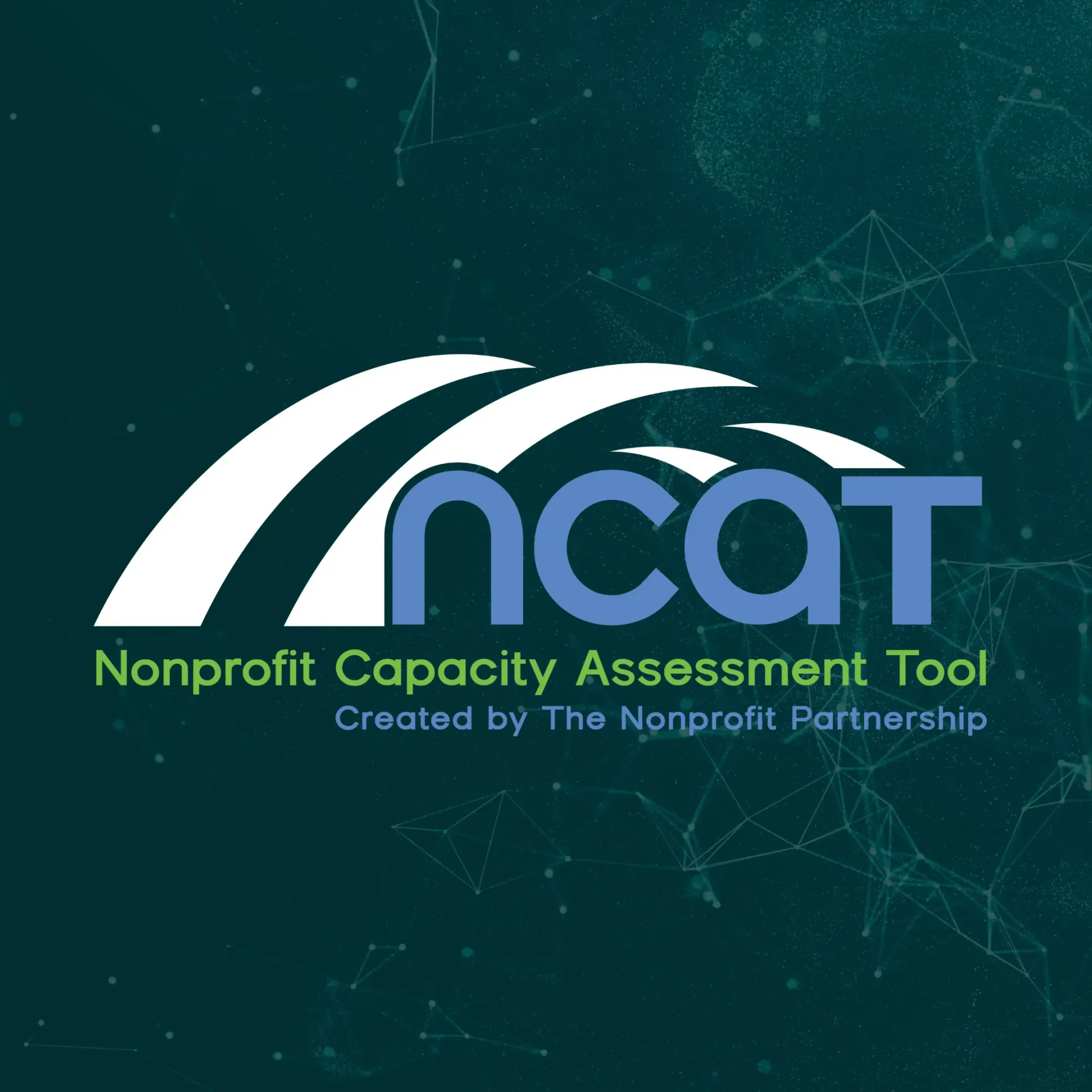
Our new logo embodies the vision of our organization. The logo features a bridge-inspired design element, symbolizing our commitment to building bridges, fostering connections, and strengthening the bonds within the nonprofit sector.
The logo redesign doesn’t change who we are, but it does help express who we’ve become. We’re excited to move forward with a visual identity that matches our passion and dedication to the nonprofit community.
Thank you for being a part of our journey. We invite you to explore our new look and join us in continuing to build a stronger, more resilient nonprofit sector.